The Resus Room
Website / App / Design
The Forward thinking Resus Room Team are consistently developing excellence in medical education and needed a streamlined website and app to promote and distribute their Podcast and CPD Diary

Saving Time through design
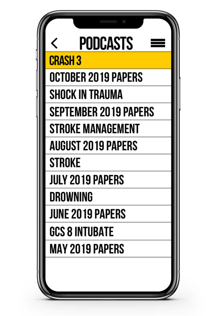
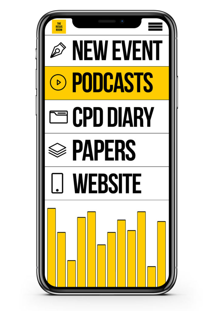
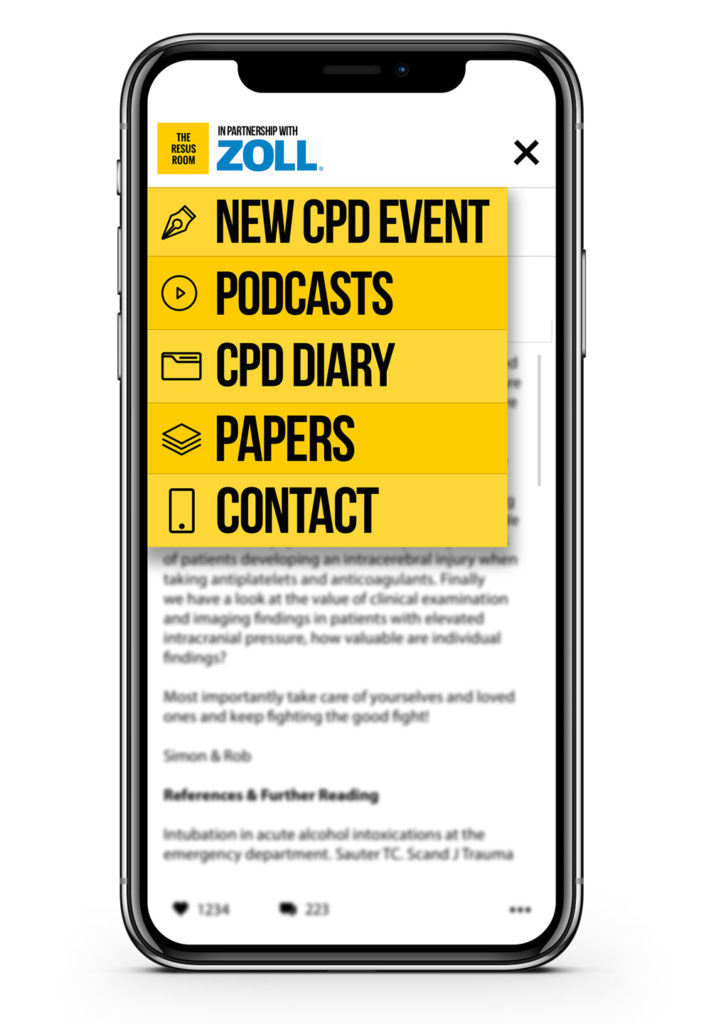
With a clinicians time being at a premium the design of the Resus Room CPD Diary had to revolve around speed and ease of use. Through the use of an always available menu, and a streamlined process for entering a new event, the online and app versions both allow the user to log their CPD within seconds.
The signup process incorporated as many healthcare specialities as possible on launch and the database is designed to add new ones with ease. Any speciality, from Paramedics to Nurses can log into the diary for free and start their CPD in seconds.
The design process
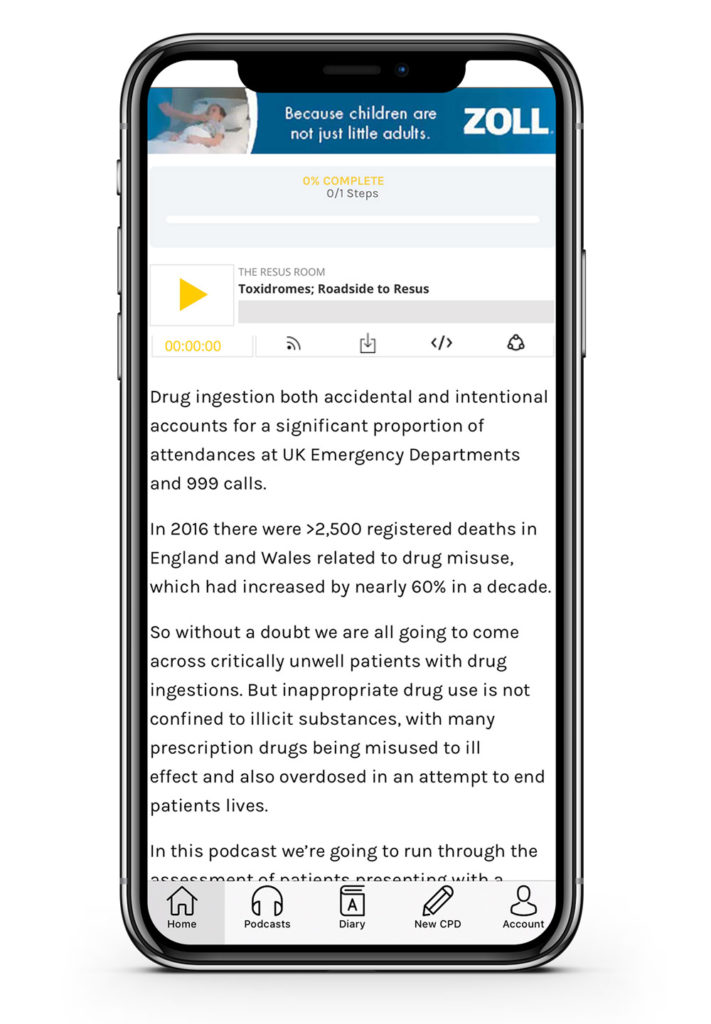
The original design incorporated the Resus Room branding throughout and used the yellow from the logo for key features. I decided to reduce this for future versions and concentrated the colour within the podcast player and the logo.


