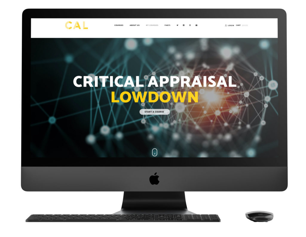
Critical Appraisal Lowdown
Website / Online Course / e-commerce
The team behind the Resus Room needed an ecommerce website to house their online Critical Appraisal Course. Built using WordPress and Learndash the website allows users to follow a series of podcast led chapters to gain knowledge and CPD time

A unique tool for clinicians
The 3 clinicians involved in the project have a passion for interpreting evidence and translating it into the best possible care for their patients, and since the launch of the course it has been completed hundreds of times and been introduced into key University settings throughout the country.
I spent some time searching for an ideal font to create a logo that complemented the uniqueness of the course. Eventually, I settled on the one below which enabled a strong colour and black version of the logo ready for online and social media use.


